|
FREE |
|
||
|
COT Charts |
|||
| Membership Info |
Home | Chart Room | Trend Trader Method | Market Update | Sign-Out |
||
|
|
|
COT Trend Trader� Using Commitments of Traders to profit in Commodities.
Written by Shay Campbell
FreeCOTcharts.com
Commitments of Traders The most valuable Fundamental and Technical information a commodities trader can use is that of the Commitments of Traders data. We often read or hear market observers talk about what �Might� be happening� �Investors are profit taking today which is driving down the Dow�. When it comes to stocks, these baseless comments are common because no one ever really knows what�s going on. Perhaps the best explanation ever given for why a particular stock, commodity or index is going up is this� �there are more buyers than sellers�. Or as a trader once told me� �there might be only one buyer today but he�s buy�n more than the rest are sellen�. Commitments of Traders is not speculation nor is it one of the thousands of price derivatives that tries to explain, anticipate or otherwise predict market movement. COT data is a complete accounting for who holds what positions in each and every commodity futures market in America. Anytime a commodity starts to move, a quick glance at the COT report tells what group is do�en the movin! The Commodity Futures Trading Commission (CFTC) issues a report each week known as the Commitment of Traders (COT) report. This COT report accounts for each position in any one market by classifying the market participants into three groups. Those three groups are as follows:
Each Friday the CFTC issues the COT report to the public. The report is based on the positions held on Tuesday of that week. Each report contains about 8,000 fields of information. The reports are very detailed with information such as concentration levels of the largest position holders, a break down of the percent of open interest held by each group, change in positions from last report, and of course the current positions held by each group. At first glance the contents can be overwhelming!
COT Analysis
In order to make sense of the cumbersome COT report, we need to break it down into manageable pieces so that each set of data can be isolated for further study. The first step is to link together each data set into a continuous string so that a historical file can be created. For example, the largest 8 concentration positions for wheat can be compiled into a spreadsheet. We could use two columns in our spreadsheet, one for the date and the other for concentration position. Finally, to conduct our study we need to add one more column for the price of wheat that corresponds with each date in our spreadsheet. Now the concentrated positions can be observed as the price of the underlying commodity moves through time. This form of analysis can be performed over and over for all of the data provided by the COT report. Since there are over 60 commodities reported in each weeks COT report, there are thousands upon thousands of combinations that could potentially be performed. This may seem like a lot of work, and it is, but some very interesting discoveries can be made if the right combinations are performed! For the purpose of this writing I�m going to isolate one aspect of the COT report that deals with �net positions�... I�ll save the other study results for another day. If the commercials net position is a positive number then the group is �net long�. If the result is a negative number then the group is �net short�. We can perform this same calculation on the large traders as well as the small speculators (also called �specs�) to see whether these groups are net long or net short. If the specs net position plus the large traders net position is equal to 100, then we would know that the commercials net position is -100. That�s because in order for a position to exist in a commodity market there must be a buyer and a seller who agree on price. This transaction results in a contract that is mediated by the commodity exchange. My only point here is that there will always be a balance between the net positions, so as one group moves from being positive to negative, one or both of the other groups MUST be taking the other side of the trade.
Isolating the Net Positions
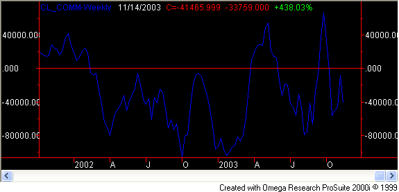
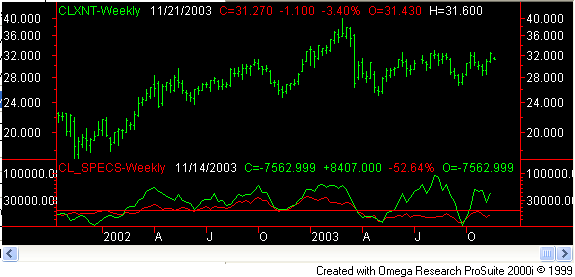
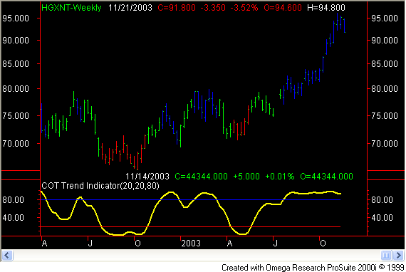
Now that the determination has been made to study the net positions of the COT report, the calculations can be made to create the net position files we will need for the study. Since the commercials are the �smart money� group, it makes sense to start our study with this group. Once again, the net position is calculated by subtracting the total short position from the total long position of each of the three groups. There are about 40 markets tracked on FreeCOTcharts.com so this means there will be a total of 120 calculations to perform to get all of the necessary net position files. Don�t worry, we do these calculations for you and then post the files to the members area of FreeCOTcharts.com for those of you who want to perform your own studies. These net position files can then be charted so we can visualize the movements over time. Figure 1. Weekly commercial net position for Crude Oil (10/01 to 11/03)
Over this two year period the commercials have collectively moved in a range from an extreme net short position of -105,964 contracts on 10/04/2002, to a net long position of 66,914 contracts on 09/26/2003. The real question we want answered is whether or not the commercials indicated by their net position which way the market would go in the future. To answer this question we can add crude oil price to the net position chart above. Figure 2. Weekly commercial net position and price for Crude Oil (10/01 to 11/03) The red line on the chart shows where the price on 10/04/2002 lines up with the commercial net position reading of -105,964 contracts on 10/04/2002. Over the next 6 weeks crude fell from a high of $31.00 to under $25.00 a barrel. The blue line on the chart lines up the extreme long net position reading of 66,914 contracts on 09/26/2003 with the corresponding crude price. The low of that week was $26.85 and eight weeks later crude closed at $32.37 a barrel. So at those two extreme points it appears that the commercials were able to weigh on the market and push price in the direction of their net position. Now let�s take a look at the large traders� net position file and see what the predictive value is for this group. To keep our analysis consistent we will use the same crude oil chart above. This time the large traders� net position will be graphed in the bottom pane of the chart.
Figure 3 Weekly large trader net position and price for Crude Oil (10/01 to 11/03)
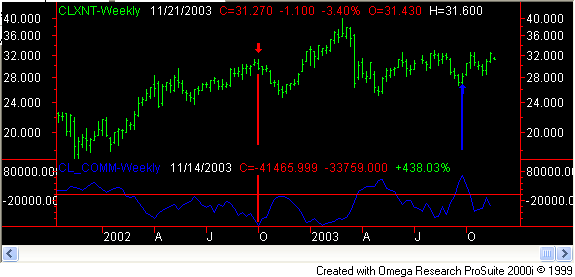
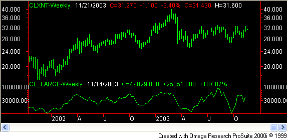
As mentioned in the description of the large traders earlier, this group is primarily made up of trend followers. The above net position data of the large traders clearly illustrates this fact as the price and net position are highly correlated. Also it should be noted that the large traders� net position will almost always be a mirror image of the commercials net position. This is the case because the large traders are the only other group with enough size to take the other side of the commercials trade. So basically no new information is gleaned from figure 3. Lastly, let�s see what happens when we insert the small traders net position file in the crude oil chart. Figure 4 Weekly small specs net position and price for Crude Oil (10/01 to 11/03)
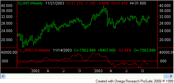
The movements of the specs� net positions are a little more muted than the commercials and large traders. In this case however the small specs have fairly closely mimicked the large traders. To illustrate this point more clearly I have overlaid the large traders� net positions in the chart below. Figure 5 Weekly small specs net position / large trader net position and price for Crude Oil (10/01 to 11/03)
Now it can easily be seen that for the most part the specs tracked along with the large traders. There are a few times, however, that the two groups separated. Most notably in mid 2003 when the large traders caught the uptrend in crude while the specs stayed short throughout the rally. Often times the specs act as an excellent contrary indicator. The problem with identifying this is that the movements are so slight with the specs that it�s difficult to identify visually. I�ll show you how to overcome this using the COT Trend Indicator. Although it is helpful to visualize the net position files as they relate to the underlying price, visual inspection is not necessarily the best analysis tool. The specs� net position above is a good example of this. The net position movements are so muted that it�s just too hard to see the signals offered by the specs. Another observation that can be made from the above study is that there were other times when the commercials net position went to relative extreme points and the crude price responded accordingly. Sometimes these relative extreme points can be muted however because the eye is trained on the most extreme readings in the chart. When the commercials net position moves to a point that is only half as great as the most extreme point it�s easy to overlook it, but this can be a costly mistake!
COT Trend Indicator
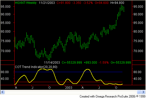
In other words, let�s take the last net position value we have and determine where within the last 20 week range it falls. By assigning the highest value of the last 20 weeks with 100 and the lowest value of the last 20 weeks with a zero, we can normalize a range for the indicator. The chart below is an example of this indicator in action which I call the COT Trend Indicator. Figure 6 Weekly COT Trend Indicator and price for Copper (10/01 to 11/03)
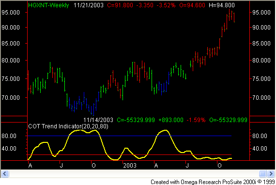
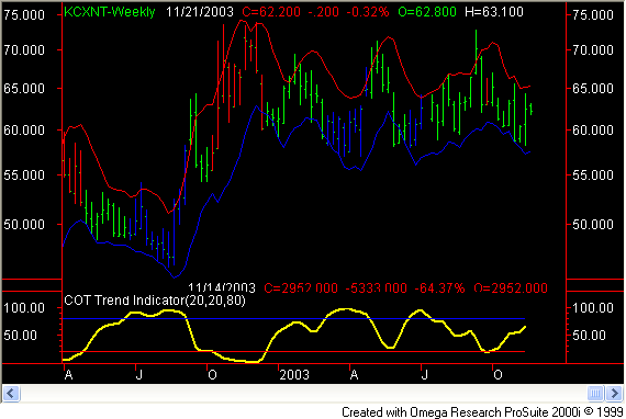
The COT Trend Indicator takes the place of the net position file. As you can see it�s much easier to see the extreme readings because they are all normalized. All of the readings of the COT Trend Indicator fall between 100 and zero. Additionally a blue horizontal line is drawn at 80 to indicate the Buy Zone and a red horizontal line is drawn at 20 to indicate the Sell Zone. With the exception of the last 2 months or so the COT Trend Indicator readings in the Buy and Sell zones have been very accurate. Now that we have readings that will always fall between 100 and zero we can further program our charting program to make the charts even easier to read. Rather than have to try and eye the points on the COT Trend Indicator that fall within the Buy or Sell zone and then locate that point on the chart, let�s let the computer do that for us. This can be accomplished by �painting� the price bars depending on where the COT Trend Indicator is on our scale of 100 to zero. When the COT Trend Indicator is registering 80 or higher, the price bars will be painted blue. When the COT Trend Indicator is registering a reading of 20 or less the price bars will be painted red. Figure 7 Commercial COT Trend Indicator and price for Copper (10/01 to 11/03)
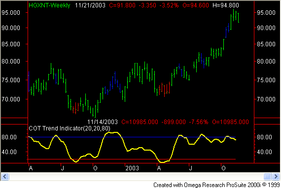
Now were making some progress! Look how well the COT Trend Indicator identifies Major turning points in the copper market. Again, the only exception is the last few months that copper has blown out to new highs. We�ll discuss how to avoid getting in front of a run away market in a moment. Let�s turn our attention back to the specs. Let�s see how the COT Trend Indicator deals with the specs since they will often have muted responses that are hard to see with the eye. Figure 8 Specs COT Trend Indicator and price for Copper (10/01 to 11/03)
Remember the specs are best used as a contrarians indicator so it�s no surprise that this group was consistently buying at market tops and selling right at the bottom. The exception once again is the last few months during the runaway upside move where even the specs seem to be making some money. Notice though that the specs were overwhelmingly short just prior to copper taking off to the upside. The contrarians indicator clearly identified the copper bull market that followed! Lastly, let�s take a look at how the large traders faired trading the copper market. Figure 9 Large traders COT Trend Indicator and price for Copper (10/01 to 11/03)
We have determined that both the commercials and the specs had missed most of the copper bull market. The large traders on the other hand have entered the bull market early on. Once again, the large traders are predominantly trend followers so catching a trend like this one is exactly what they attempt to do. Another observation about this group is that they tend to be fully long at market tops and fully short at market bottoms. But notice how they seem to always catch a portion of the trend before the move plays out. There�s something to be learned from the large traders in this regard! The charts above are the same as the charts in the members chart room. These charts are updated each Friday after the COT report is released. These charts are provided for those who don�t want the hassle of maintaining their own charts. The net position files can also be found in the members area for those who would like to conduct studies of their own.
Trading the COT Trend Indicator
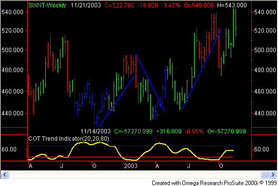
With the aid of the COT Trend Indicator market entry becomes much more precise. Like all indicators, however, there are limitations as to what an indicator can provide. Just like the copper that shot straight up and the whole time the commercials were steadily selling into the rally. After watching these net positions for a while you will start to see that the commercials often do sell into rallies and buy into sell offs. This is why commercials are also referred to as hedgers. Their job is not to make money on position trading the commodity, but rather they are attempting to offset the physical inventory they posses for the day to day operations of their business. To maximize the probability of winning on any given trade it�s best to wait patiently for the COT Trend Indicator to issue a buy or sell signal, and then wait some more! Rather than step in front of a freight train, it�s best to wait for a trigger to enter the market once the COT Trend Indicator has given us the set-up. The two triggers I find most useful are trend lines and volatility bands. Trend lines are easy to use and understand. They are also very effective. I wait until I get a good set-up based on the COT Trend Indicator before I start drawing trend lines. Once I�ve decided to start looking for a trigger to enter a market I will draw a trend line in one of two ways. The preferable trend line is one that naturally fits the trend in question touching several lows if in an uptrend and several highs if dealing with a down trend. A good example of this is in the silver chart below. Figure 10 Commercials COT Trend Indicator and price for Silver (10/01 to 11/03)
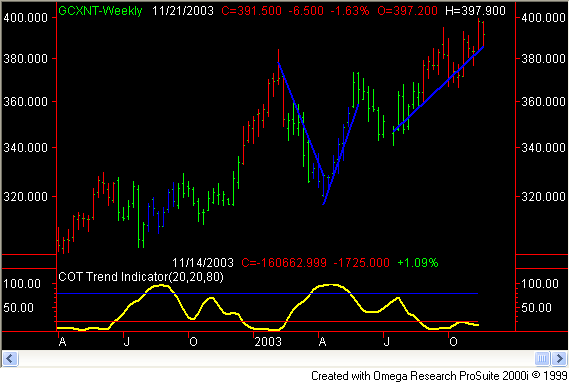
Each of the trend lines in figure 10 are easily placed on the chart because a well defined trend is established by silver. Notice how symmetrical each of the shorter term trends are. When the trend line is broken it is apparent that the trend has changed directions. It can also be helpful to drop down one time frame to a daily chart to draw the trend lines once the set-up has occurred on the weekly chart. Another type of trend line I use with the help of my charting program is a regression trend line. This just means that it�s a �best fit� line drawn based on the highs, if drawn in a down market, and based on the lows if the market is in an uptrend. Examples of regression trend lines can be seen on the Gold chart below Figure 11 Commercials COT Trend Indicator and price for Gold (10/01 to 11/03)
Regression lines are helpful because they fit themselves to the exact slope of the trend in question. Rather than waiting for the traditional trend line to be broken, a signal can be based on how far price moves away from the regression line. Another use of regression lines is to gauge the range of the most recent market action. For example, look at the Gold chart above. The COT Trend Indicator has issued a sell set-up and the market has been moving up to sideways. A regression line was drawn based on the lows of the most recent uptrend. As gold pulls away from the trend line one could expect that price will be drawn back to the trend line. So a sell could be attempted if price moves to the upper end of the recent range with the anticipation that price will move back down to the regression line. The other tool I mentioned was volatility bands. A unique tool that self adjusts to the market based on the most recent volatility. These bands are created in many ways, one of which uses the range of the last x periods. For example, we could construct �Average Range� volatility bands by plotting a 5 period simple moving average. Then we would add to this the average range (high � low) of the last 5 days to create an upper band. For the lower band we take the same 5 day simple moving average and subtract the average range (high � low) of the last 5 days. The result is shown in the Coffee chart below. Figure 12 Commercials COT Trend Indicator and price for Coffee (10/01 to 11/03)
These self adjusting bands will often contain price inside the bands. The exceptions will often result in price snapping back to realign with the recent market activity. Trades can therefore be placed to bet that price will come back into alignment. Conversely the volatility bands can be used just like trend lines where we wait for a break after The COT Trend Indicator has issued a buy or sell signal. I will often times use both the volatility bands and trend lines in my analysis so both might be displayed on the members charts. Trend Trading Stock market wisdom from "They say you never grow poor taking profits. No, "Remember that stocks are never too high for you "I began to realize that big money must necessarily be in the big swing. "A loss never bothers me after I take it. I forget it overnight. "Of all speculative blunders there are few greater than trying to Reminiscences of a Stock Operator This sound advice by the "stock operator" is at the heart of Trend Trading. The objective is to catch the big swing and ride it till the end. This is going to require being wrong from time to time. In fact, if done properly it will result in being wrong more than right. If you dump the losers quickly and keep the winners for the big swings, then the win/loss ratio want mater so much. Using the commitments of traders data, however, gives us an edge over just blindly buying and selling when the market starts to move. Instead, we can wait until the COT data dictates that a large move is likely and then jump on the trend when it starts to go. Once in, set a hard money management stop to limit the loss. When the trade moves in our favor, trail a stop loss order behind the move until we get stopped out for a profit. The best method I know of for managing a trade is to use volatility based stops. As discussed earlier, volatility bands can be used as the trigger that gets us in the market. The same goes for getting us out of the market. Volatility bands self adjust to the current volatility of the market so they will tighten up when to the price when things are calm and then spread out when the market gets nervous. If weekly charts are used to identify the trade setup, then daily bars are best used to do the trading. By placing volatility bands on both the weekly and daily charts we can get a much better feel for the market and make better trading decisions. Good trading, Shay Campbell
|